Title
San Juan, Puerto Rico – Rebranding
Date
May 31, 2013
This project was made for my class Corporate Branding. We had to rebrand our capital city, in my case the capital was San Juan. Next is a brief from my process through the project.
A MAKEOVER IS what San Juan City needs. The city of San Juan is a beautiful place with a lot of history. It has the Old San Juan, where all the history can be seen here and the New San Juan, a more modern place. One of the problems of the tourism is the lack of advertisement about the city. Of course the city has their own events but only the locals knows about that. We need to expand our culture, our events beyond the seas. We need to focus what the city can give and attract more people of all ages. We must have more family events so the adults and the children can enjoy it. Below I will mention three points that maybe should change to improve the tourism in San Juan City.
 Logo or seal of San Juan City. San Juan don’t actually has a logo of the city, just the seal. The color is just formal, nothing fancy in the design that get my attention, and the font it is very serious. It is a traditional seal or coat of arms to preserve respect to the city. This seal should use for formal events or documents but not to welcome tourists.
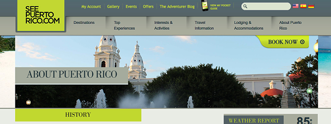 Being a puertorrican, I had trouble to find a good website or an official website that give me the right information of San Juan City. There are two: seepuertorico.com and sanjuancapital.com*. The 1st one is more complete and attractive than the 2nd. It has a gallery and a complete information about San Juan. The 2nd is just a boring and formal website that only shows telephones numbers and there is no English version.
*While I was doing the project in 2013, the website sanjuancapital.com wasn’t updated. Currently it has improved.
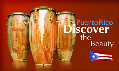 The slogan for tourism in San Juan (in Puerto Rico general) is “Puerto Rico does it better!”. The slogan was used a lot like 10 years ago but now there is not a lot of campaign about it. Maybe the only advertisement I can think of, and I searched, is the brochures and the celebrities like Ricky Martín, where that don’t tells exactly what San Juan is about.
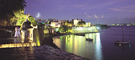
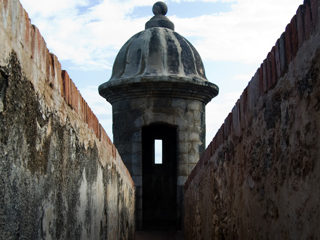 BRANDING WILL HELP the volume of visitors to the city of San Juan. We should focus what the people want to see and to do during their visit on the island, specially in the capital. First we need good publicity and marketing in the tourism company. Try to go to another angle and attract people around the world. We can invest on commercials or billboards in different locations around the world. The city has a lot of potential to give. Many sight-seeings for every angle and for every single person like for example, if you want to see historic buildings or architecture, the best place to go is Old San Juan where you can learn a lot of the 1600’s culture and appreciate the surroundings. If you want to try the local foods, again in Old San Juan you can find it. There are a lot of great places to visit in Old San Juan. But if you are a modern look person, the New San Juan (located on the Condado and Isla Verde area) is the place to be. Nightclubs, fancy dinning, boutiques, hotels and beaches are among the things you will find here.
 To re-brand, we must focus what is going on today. What people like? What people are looking for in San Juan City? How to capture their attention to go and visit? We need new image, more appealing information, the website has to be updated every week with new activities, invest on advertisement in different target points. One of the things that probably cause problem is that sometimes seems pricey San Juan City but we need to convince that is worth it to spend there and let the visitors with a satisfying memory.
SAN JUAN CITY is one of the most popular city in Puerto Rico. It is also known as “Metro Area”. Is where all the fun, excitement and history begins. But the current brand is not telling you that. Matter fact I cannot see or tell what is the current brand for the city. It looks unorganized and don’t define the essence of the city. What I can tell about this gorgeous place according for this archetypes: the explore, the romantic and the revolutionary.
The city has a lot of places to visit that could travel back in time. The history in the streets of Old San Juan is fascinating. You can appreciate the architecture from the 1800’s and all the art that surrounds it. And if you want to visit a more modern area, you can go to the East part of San Juan, el Condado.
When you walk on the cobblestone road and the narrow streets, you will feel that you are in a different era. Most of the couples choose San Juan to get married. Either on the antiques buildings or at the beautiful sunset at the beach.
Even though the explorer and the romance, the city can be feel a revolutionary place. Of course they don’t alternate the “old” but want to make constant changes on it’s surrounding to please the people. I think is unnecessary to change the archetypes. In fact, we should upgrade the existing archetypes since the city is fun, romantic and adventurous as it is.
For the final step, I sketched a couples of logos and used some of San Juan’s beauty so catch the color palette. Below are some of the images that I used to pick the color for the logo.
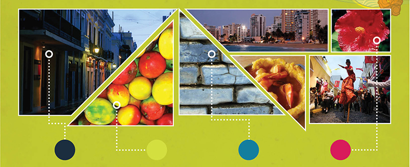
The city of San Juan has many options to be inspired to create a logo but where I wanted to focus is the history, fun and modern part of the city. I took the liberty to be inspired by a popular handicraft (Vejigante’s Mask). I wanted to integrate it because is a classic art in Puerto Rico, and you can see them on the popular carnival in Old San Juan every year in January. The carnival is called La Calle de San Sebastían. People dress up, wear the mask and dance the traditional bomba and plena. You can also see the mask in various stores around San Juan. For the type, I did not want some classic or formal type, instead I used a script type so it can be seen casual and maybe more modern. For the colors, I choose an avocado-mango green so it looks fresh and reminds the viewer that San Juan is from a tropical island. And the magenta so you can feel the fun and the excitement that San Juan can give.
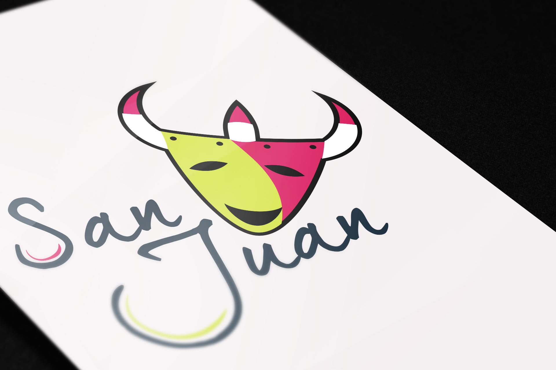
San Juan CIty Logo


