Me personally I do love retro art and I know that some of you also. In this tutorial on vectips.com can show us how to create a retro art by using the grainy effect on Illustrator.
Creating grainy textures are great for retro illustrations, typography, and logos. Alternatively, you can incorporate these effects into compelling new styles. You can always scan in similar textures and Live Trace them in Illustrator, but you can pretty easily create this type of effect all inside Illustrator!
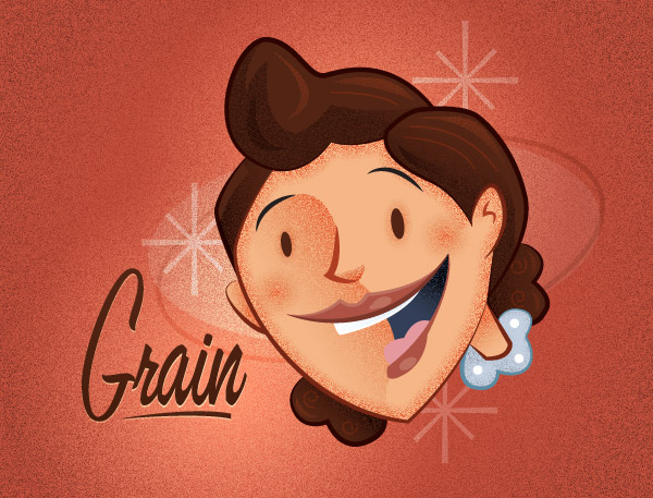
Here is a sample image of what these techniques can do. Further down in the tutorial, I give a quick breakdown of the process.
 Tutorial Details
In the following sections I’ll show you how to create these grainy textures from a couple of different elements within Illustrator. Basically you can create these textures from any element that contains a graded value of color (like a gradient). I’m sure some of you have already figured out this technique by creating some of the past Vectips texture tutorials or on your own, but for those of you that haven’t, you should have fun.
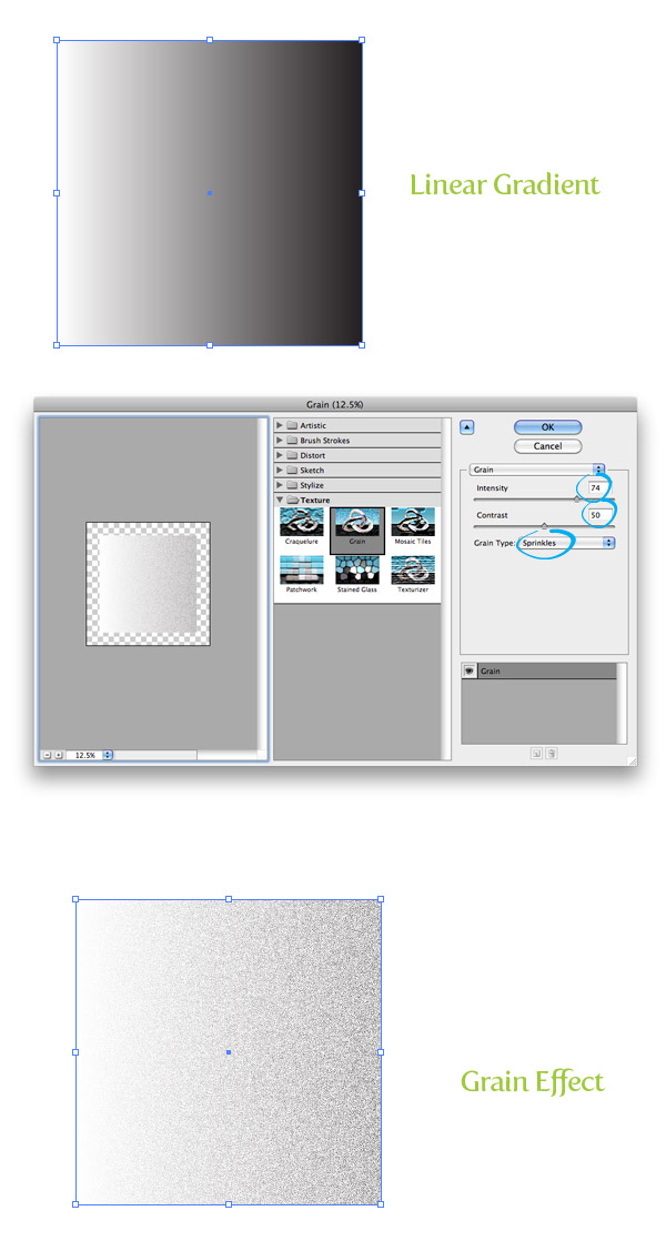
First up is gradients. Gradient are good for creating grainy textures that don’t require any complex contours to the texture. To start, create a simple linear gradient with the default white and black color stops in a rectangle. With the gradient selected, go Effect > Texture > Grain. In the Grain Effects dialog, change the Intensity to 74 (you can experiment with this number to get the grain you desire), Contrast 50, and Grain Type to Sprinkles. That’s really all! The real magic comes when you apply color and blending modes to the texture.
You can change the color stops in your gradient, but I like to place an object or new fill below the grain effect and set the grain’s blending mode to Multiply because of the white space the Grain effect creates. Let’s take a look at doing this with the Appearance panel.
Take your same rectangle and fill it with a solid color. From the pop-up menu of the Appearance panel, select New Fill. Select the top copy and fill it with a linear gradient. Change the first color stop to white and the second to a darker color than your original. With the gradient fill still selected, apply your Grain effect and set the Blending Mode to Multiply from the Opacity item under the gradient fill.

Gradient Meshes are great for creating more complex shapes with grainy textures. To start, draw an abstract shape with a tool of your choosing and fill it with black. You can either go Object > Create Gradient Mesh and set a specific numbers of points or use the Mesh tool (U) to click on your artwork to add mesh point. I’m using the Mesh tool (U), so deselect the artwork, select white from my swatches, and with the Mesh tool (U) click on the artwork to add points. Now, apply the grain effect like before.

Like with the Gradient technique, meshes work great with a color underneath and the grain’s blending mode to Multiply. Start the original shape a solid color and Copy (Command + C) and Paste in Front (F). Change the fill of the copy to a darker color of the original shape, apply the white mesh points, apply grain, and set to Multiply.

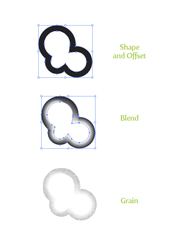
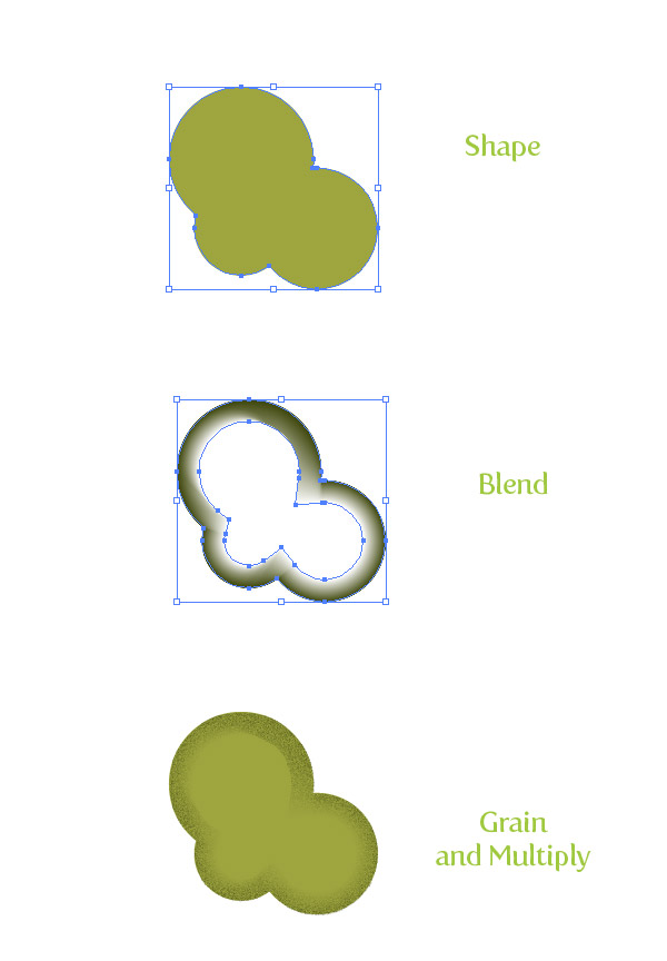
Blends tend to work great for either simple grainy textures or complex ones. It really just comes down to how you work and which is more comfortable, but the principle is pretty much the same. For the example, created a shape, go Object > Path > Offset, fill the offset with white, select both copies, and go Object >Blend > Make. Finally, apply your grain effect.
Like both the Gradient and Gradient Mesh, it’s good to have an underlying color. Also like gradient meshes, you will need a copy of the original shape above the color with a darker color, grain, and blending mode set to Multiply.
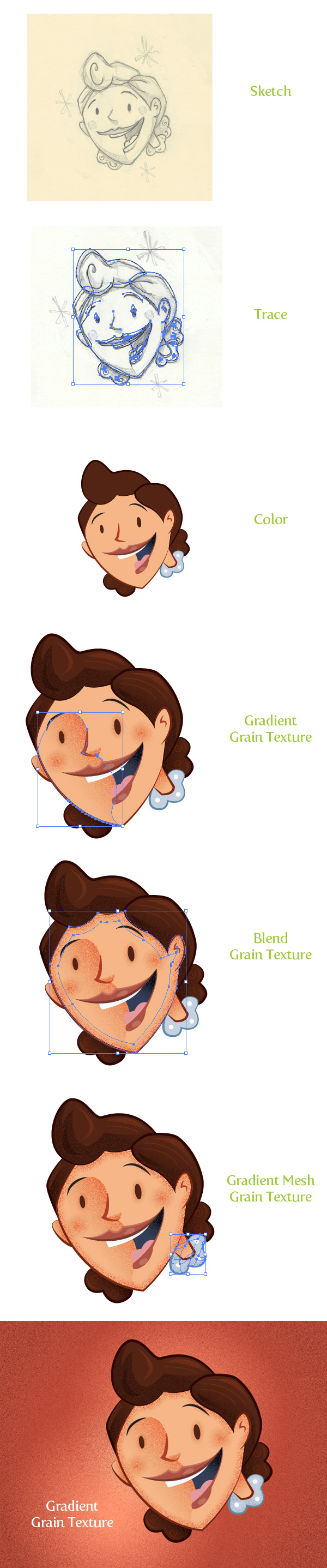
Here is a quick tutorial utilizing some of the techniques. I won’t go into much depth, it’s just to get an idea of how to use these techniques in an illustration.
First, I created a sketch, scanned it, and traced it with the Pen tool (P). Next, I filled the trace with color, and added stroked paths set with one of Illustrator new Stroke Profiles (Width Profile 1). To add more depth with the grain textures, I started with the linear gradients in the skin and hair. I used a blend for the outline grain texture face shape and used a gradient mesh for the collar of the character’s shirt. For the background I used a big radial gradient grain texture. I also used a radial gradient with the first color stop white, the second white with 0 Opacity, grain, and set the Blending Mode to Overlay.
This is a great technique to experiment with! Experiment with different colors, shapes, blending modes, and layering of textures. Try these techniques on graphical elements other than illustrations. They work great on text, logos, UI elements, and more! You can even incorporate these effects with some of the other texture techniques I have written about.
Source: http://vectips.com/tutorials/create-grainy-textures/
Categories


Submit a Comment